Color is one of the easiest ways to express something in our world. It transcends language, symbols and adds beauty to our surroundings. Color is immediately visible. It distinguishes, enlightens and organizes elements without a word. World-over, it helps people classify and establish a system so easy to follow that no explanation of how to interpret its meaning is necessary.
Color can be used in a variety of ways in everyday life. Color carries mental associations with it. It can be used for branding purposes, to generate feelings, to grab attention, to direct, to exude a sense of place or home or to convey a sense of importance, class or prestige.
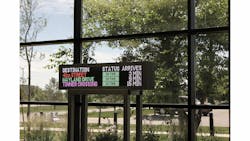
Digital signage is a very direct way to convey a message, especially in the mass transit industry. When passengers are trying to figure out how to navigate through a facility or to find their chosen method of transport’s latest information — such as schedule or service notifications — implementing the use of color makes the message that much easier to comprehend, resulting in a faster response time and reduced foot traffic congestion.
In evaluating the best uses for color digital signage, following are five key points of color communication.
1. Graphic-Aided Text
Humans are able to interpret the meaning of symbols faster than plain text, resulting in a quicker response time. When the two are combined, it reduces questions about the intent of the message. When a person sees the words “fire alarm” with a symbol of flames next to it in red or orange, they know flames imply a threat of danger, prompting a quick reaction for safety. In addition, when agencies need to meet ADA compliance in being able to communicate to all travelers with established ADA symbols, color is the most effective method.
2. Communicating Important Information
The second reason for color signage is perhaps the most applicable and basic for users: getting them the information they need about service disruptions and schedules to make an informed decision about their journey. If their train or bus is running late or was in an accident, riders can keep their schedules by choosing another option.
3. Advisory and Safety Updates
Travelers need the necessary information to make alternate route plans when conditions are unsafe or weather calls for change. Additionally, when national safety threat levels change, full-color digital signage is an effective way to distribute information that travelers might not have access to via other methods. In issues of safety, when time is of the essence, every moment matters.
4. Agency Initiatives
Sales or specials on services mean saving money, which a green dollar sign easily communicates. The same goes for calling attention to a good deal. Using color to draw viewers’ eyes is an effective sales method.
5. Maintaining the Best Image
Image is everything, and agencies need to look their best in order to maintain a favorable standing in their customers’ eyes. Agencies want to look current; they want people to be able to see that they are keeping up with technology, offering the latest innovations to make everyone’s day a bit easier. This plays into customer loyalty. “I take X Transportation because ...” tying into agency branding and a sense of identity.


